Build a Responsive Video Gallery
I recently worked on a website redesign that needed a video gallery. It was a WordPress project and would contain videos from YouTube and Vimeo. I decided a custom post type and custom fields was the best approach, and what follows is the HTML5/CSS and jQuery app, Fancybox.
The code I wrote is open source and free to copy, use, or change.
Fancybox is Copyright © Protected by Janis Skarnelis:
First write the HTML
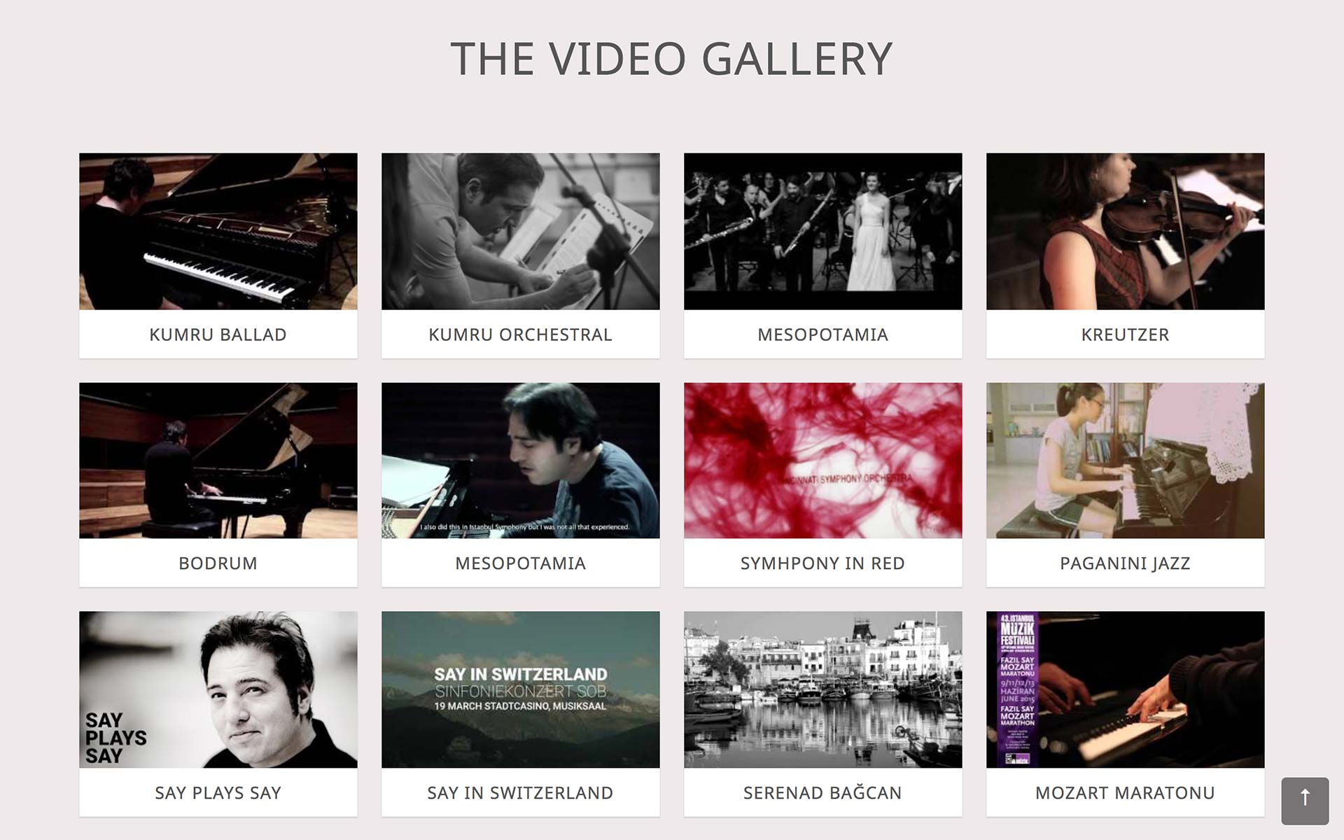
<article class="video">
  <figure>
    <a class="fancybox fancybox.iframe" href="http://www.youtube.com/embed/paG__3FBLzI">
    <img class="videoThumb" src="http://i1.ytimg.com/vi/paG__3FBLzI/mqdefault.jpg"></a>
  </figure>
  <h2 class="videoTitle">Mesopotamia</h2>
</article>- Use two classes:
fancyboxandfancybox.iframeon theatag. - Use the URL in the iframe embed code, not the copy and paste URL.
- Right click on the YouTube or Vimeo video thumbnail and copy the image URL for the source.
- Use your own class names for the
article,img src, and video title.
Next is the CSS
/* First make sure the video thumbnail images are responsive. */

img {
  max-width: 100%;
  height: auto;
}

/*
This is the starting grid for each video with thumbnails 4 across for the largest screen size.
It's important to use percentages or there may be gaps on the right side of the page.
*/

.video {
  background: #fff;
  padding-bottom: 20px;
  box-shadow: 0 1px 1px rgba(0, 0, 0, 0.15);
  width: 23%; /* Thumbnails 4 across */
  margin: 1%;
  float: left;
}

/*
These styles keep the height of each video thumbnail consistent between YouTube and Vimeo.
Each can have thumbnail sizes that vary by 1px and are likely break your layout.
*/

.video figure {
  height: 0;
  padding-bottom: 56.25%;
  overflow: hidden;
}

.video figure a {
  display: block;
  margin: 0;
  padding: 0;
  border: none;
  line-height: 0;
}

/* Media Queries - This is the responsive grid. */

@media (max-width: 1024px) {
  .video {
    width: 31.333%; /* Thumbnails 3 across */
  }
}

@media (max-width: 600px) {
  .video {
    width: 48%; /* Thumbnails 2 across */
  }
}

@media (max-width: 360px) {
  .video {
    display: block;
    width: 96%; /* Single column view. */
    margin: 2%; /* The smaller the screen, the smaller the percentage actually is. */
    float: none;
  }
}

/* These are my preferred rollover styles. */

.video img {
  width: 100%;
  opacity: 1;
}

.video img:hover, .video img:active, .video img:focus {
  opacity: 0.75;
}- The media query breakpoints are videos 4 across for sizes greater than 1024px, 3 across for sizes greater than 600px, and 2 across for sizes greater than 360px. At 360px the videos are no longer floated, but rather
display:blockin a single column. - I like the widths and margins to be fluid with percentages for the responsive layout.
- It’s important to stretch the thumbnail image with
width:100%on screen sizes that exceed the natural size of the image. When the screen size is smaller, the width of the article is smaller than the images’s natural size, andmax-width:100%takes over so the images are responsive. - Styling the video titles are also important – if the titles are on top of, or below, the video, and are not consistent across each video, each article height will be different and break the layout.
Using Fancybox
// These can go in the footer.
<script
  src="http://code.jquery.com/jquery-3.3.1.min.js"
  integrity="sha256-FgpCb/KJQlLNfOu91ta32o/NMZxltwRo8QtmkMRdAu8="
  crossorigin="anonymous"></script>

<script>js/jquery.fancybox.min.js</script>

<script>
  $(document).ready(function() {
    $('.fancybox').fancybox({
      padding   	: 0,
      maxWidth  	: '100%',
      maxHeight 	: '100%',
      width   		: 560,
      height    	: 315,
      autoSize  	: true,
      closeClick  : true,
      openEffect  : 'elastic',
      closeEffect : 'elastic'
    });
  });
</script>- Fancybox includes a style sheet you need to copy and paste into your CSS.
- First call the jQuery library from the jQuery CDN.
- Then initialize Fancybox.
- There’s a lot of documentation on how to use Fancybox. You can check the docs on GitHub, on fancybox.net, and on fancyapps.com.